A Leap Towards Universal Accessibility in Digital Spaces
ROLE/TIMEFRAME
Product Manager
An intense four-week sprint, dedicating over 160+ hours to the project.
PROCESS/METHODS
Our approach was methodical and human-centered, starting with extensive research and synthesis through surveys, interviews, and affinity mapping, leading to the creation of detailed user personas. This foundational work informed our ideation and delivery phases, where rapid prototyping and usability testing were key.
TOOLS
Productboard for feature prioritization and roadmap planning.
Jira for agile project management and issue tracking.
Figma for designing wireframes, prototypes, and high-fidelity screens.
Miro for affinity mapping and ideation sessions.
Click play to view full high fidelity demo of AUDILINK.
THE PROBLEM
The digital exclusion of individuals who are deaf or hard of hearing due to the absence of accessible features like Closed Captioning in many platforms was a pressing issue. This gap hindered their ability to fully engage with and participate in digital spaces.
THE SOLUTION
AUDILINK emerged as an innovative medically implanted chip, transcending traditional accessibility tools by converting all sounds into accurately translated thoughts. This solution envisioned a new realm of digital engagement for people with hearing impairments, granting them the unprecedented ability to 'listen' through thought.
JOURNEY OF INNOVATION
Our pivot from focusing narrowly on the Clubhouse app to exploring broader accessibility issues across digital platforms marked a turning point in our research. By expanding our survey scope and revising our interview questions, we captured a more comprehensive view of the digital accessibility landscape. This pivot was crucial in developing AUDILINK, as it highlighted the essential need for a solution that could integrate seamlessly into users’ lives beyond the constraints of existing technologies.
SURVEYS & INTERVIEWS
We put together a survey of 9 questions and got 23 responses. With all of those data points the trends about feelings, needs and behaviors began to emerge.
INTERESTING SURVEY TRENDS
Our interview questions were constructed around understanding how users are currently using closed captioning, their interactions with accessibility options available in other apps and what could possibly replace closed captioning altogether in the future.
A STANDOUT QUOTE FROM THE INTERVIEWS
“There was a horseback riding instructor who wanted to put me in the handicap group just because of my hearing. As I was working on my PhD at the time, and physically able, I couldn’t understand why someone would think I cannot ride just like anyone else. The interesting thing was when we had a substitute instructor, my hearing was no problem at all. The substitute taught me a few signs, asked me to watch her and she showed me what to do. She didn’t mind using a microphone either. That made me understand that it was less my hearing that was the actual problem, but rather other people’s attitudes towards communication barriers and focus on speech.”
- Anna from Sweden
AFFINITY MAPPING THE DATA
DEVELOPING A USER PERSONA FROM THE RESEARCH
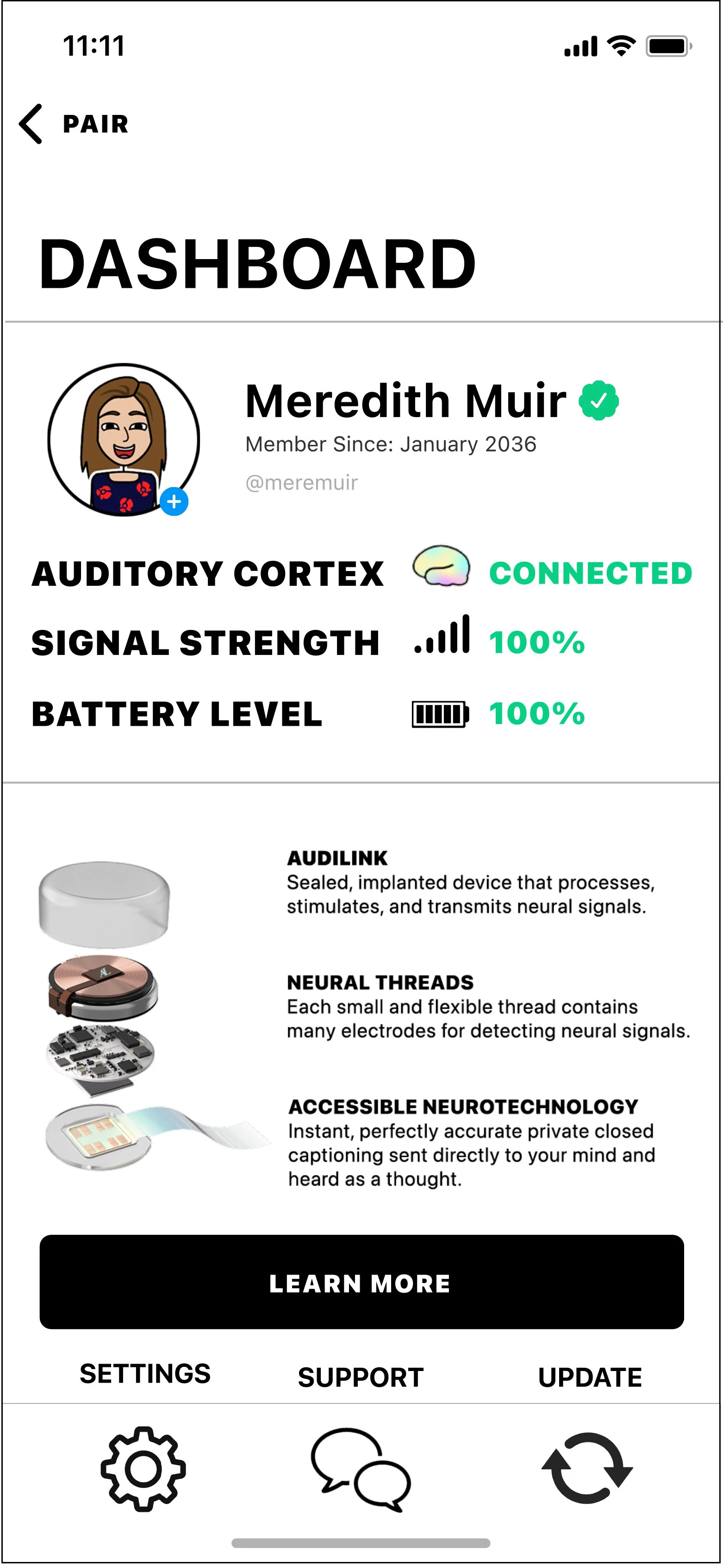
Meredith is very hard of hearing, but she doesn’t consider it a disability. It doesn’t stop her from being very engaged in the world around her, especially on social media. She likes knowing about all the new apps her friends are using and makes sure to claim her username on each. Recently, an audio-based chat room social media app came out, but Meredith is unable to participate due to a lack of Closed Captioning.
ANXIETIES/FRUSTRATIONS
Doesn’t feel like every digital space is equally accessible to everyone
Commonly feels left out
Gives up on an unaccommodating platform
GOALS/WANTS
Stay on top of all the new social media network trends
Feel included in all online spaces
“I simply don’t use digital spaces that are not accessible.”
CREATING NEW SOLUTIONS
Ideation sessions were a really interesting way to gain interesting perspective from people who hadn’t been thinking about this idea a lot. This would prove very valuable in where the idea ultimately ended up.
A SUSPENSION OF DISBELIEF
After someone in our ideation sessions suggested a brain implant chip that could hear for you — it stuck with me. I couldn’t stop thinking about what that would possibly be like for someone who can’t hear very well, or at all.
We were talking about something far different from a hearing aid.
This something would be attached to the Auditory Cortex part of the brain in a way that would allow sounds to become thoughts a person hears in their mind.
I was a little torn on going down this path because it does require a suspension of disbelief to assume the future medical technology is in place for having one implanted. But we probably aren’t that far off from something like this becoming available in the future.
UNCOVERING THE BASIC USER FLOWS OF AUDILINK
WIREFRAMES & USABILITY TESTING BEGINS
Once basic user flows were down, we began sketching wireframes so that usability testing with them could begin. It would be very basic and low key. I asked the users to point with a pen to the screens and buttons that made sense for achieving a few user goals we came up with.
After running several usability tests this way, we took those sketches into Figma and created digital wireframes with placeholder images.
Here you see the greyscale wireframes are overlaid back and forth with the high fidelity versions.
HIGH FIDELITY SCREENS
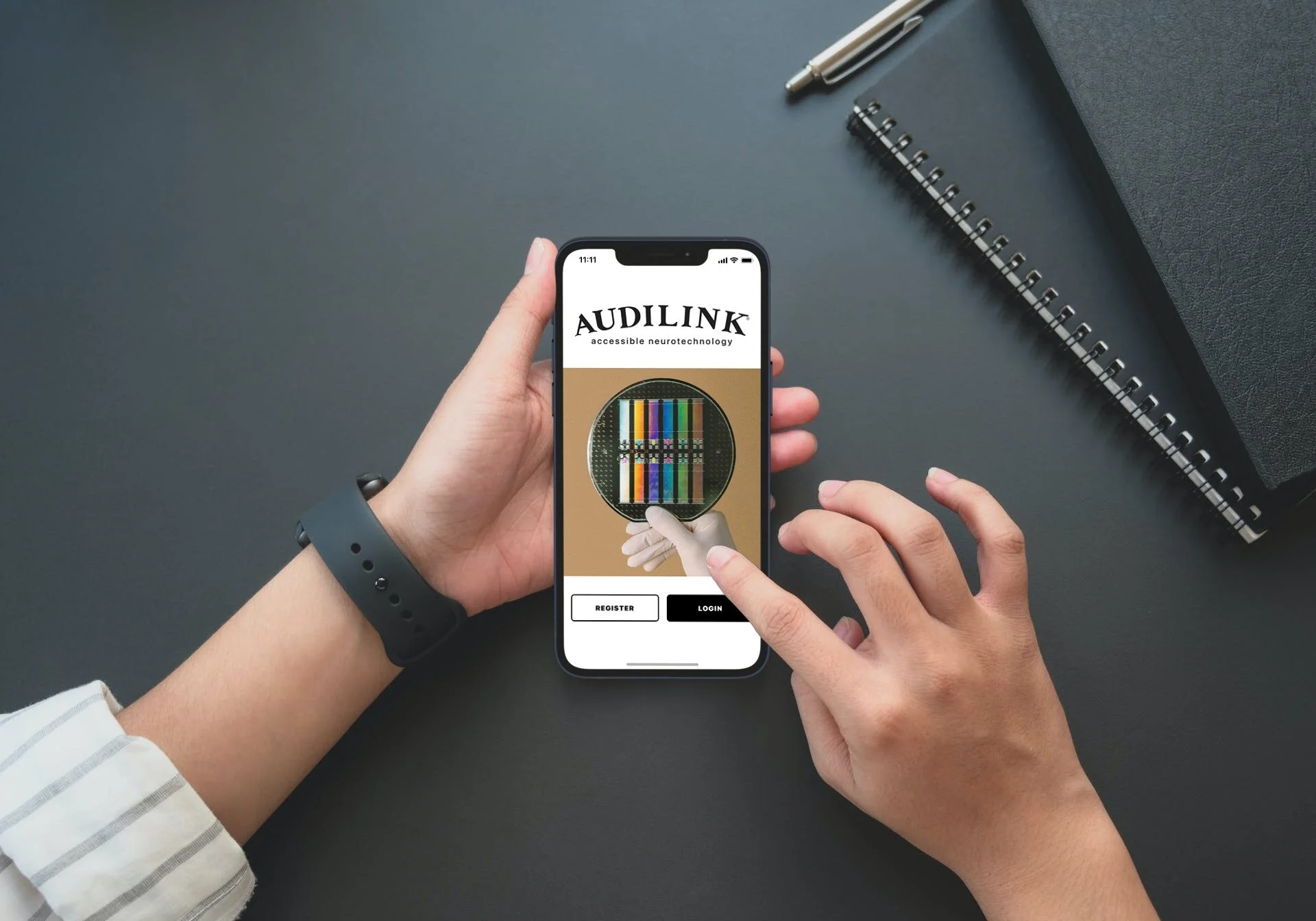
Home Screen
Settings Screen
Connect Screen
Support Chat Conversation Screen
Dashboard Screen
Update Screen
IMPACT AND LESSONS LEARNED
AUDILINK's development was a testament to the power of empathetic design and the importance of accessibility in technology. The project not only showcased our ability to innovate in response to genuine user needs but also reinforced the significance of being open to change, leading research with an unbiased perspective, and maintaining agility throughout the product development process.
Embracing Pivots: The willingness to shift our research focus was instrumental in uncovering the true breadth of accessibility challenges faced by our target audience.
Research-Driven Design: Letting user insights guide our ideation led to the groundbreaking concept of AUDILINK, challenging us to think beyond current technological limits.
Iterative Approach: Our commitment to rapid prototyping and usability testing ensured that the final product was both innovative and user-friendly.


