A story of bookkeeping, accounting, and empathy.
This is a case study for a company called Pay App Solutions.
*Along with my three teammates, I was tasked with completing research, synthesizing collected data, ideating possible solutions and designing around them. All the while keeping the branding guidelines of the company in mind.

Click play to view full high fidelity demo of Pay App Solutions.


ROLE/TIMEFRAME
UX/UI Designer & Researcher
Three-week sprint
300+ hours

PROCESS/METHODS
Research & Synthesis: Surveys, interviews, affinity mapping & user personas
Ideation & Delivery: Building a solution, rapid prototyping, usability testing

TOOLS
Miro
Figma
Photoshop


THE PROBLEM
Pay App Solutions is a bookkeeping and accounting business specializing in servicing small contractor companies. They have a website, but their target audience isn't often online, and the visiting traffic isn't converting into any initial quotes or conversations about becoming new clients. They need a more effective way to reach out to construction business owners so that Pay App Solutions strives and grows.


THE SOLUTION
A website design based on thorough research to eliminate the pain points of the current design and getting generating new free estimate.
SURVEYS & INTERVIEWS
We put together a survey of 7 questions and got 14 responses. With all of those data points the trends about feelings, needs and behaviors began to emerge.
INTERESTING SURVEY TRENDS

Our interview questions were constructed around understanding how users are currently using closed captioning, their interactions with accessibility options available in other apps and what could possibly replace closed captioning altogether in the future.
A STANDOUT QUOTE FROM THE INTERVIEWS

“There was a horseback riding instructor who wanted to put me in the handicap group just because of my hearing. As I was working on my PhD at the time, and physically able, I couldn’t understand why someone would think I cannot ride just like anyone else. The interesting thing was when we had a substitute instructor, my hearing was no problem at all. The substitute taught me a few signs, asked me to watch her and she showed me what to do. She didn’t mind using a microphone either. That made me understand that it was less my hearing that was the actual problem, but rather other people’s attitudes towards communication barriers and focus on speech.”
- Anna from Sweden
AFFINITY MAPPING THE DATA
DEVELOPING A USER PERSONA FROM THE RESEARCH
Ron is a contractor who is not active on social media. He currently finds work through recommendations and word of mouth. He does not spend a lot of time on his phone. He is currently doing his own accounting and bookkeeping on Quickbooks, but is finding that at the end of the month his paperwork is a jumbled mess.
After working long days, he wants to see a clear shot of his profits and expenses without trying to decipher and haggle with loads of paperwork.

ANXIETIES/FRUSTRATIONS
The expense of having an accountant bookkeeper.
Slow responses and results from bookkeeper/accountant while clients are waiting impatiently to submit payments.
Small teams make him feel it is less necessary to have a full blown accountant/bookkeeper for his company yet Ron still finds his paperwork could use assistance with how disorganized it is.
Lack of transparency, communication, and results make it difficult to continue to trust an accountant/bookkeeper with their paperwork.
GOALS/WANTS
Cost efficient way to justify using a bookkeeper/accountant
Accessible way to upload forms online while out and unable to use a desktop.Wants to have access to his documents whenever he wants because he likes to keep track of his expenses and profit on a project basis.
Not super tech savvy, so needs a user centered design around his busy day.
“The success of my business relies on my personal relationships.”
CREATING NEW SOLUTIONS
Ideation sessions were a really interesting way to gain interesting perspective from people who hadn’t been thinking about this idea a lot. This would prove very valuable in where the idea ultimately ended up.

A SUSPENSION OF DISBELIEF

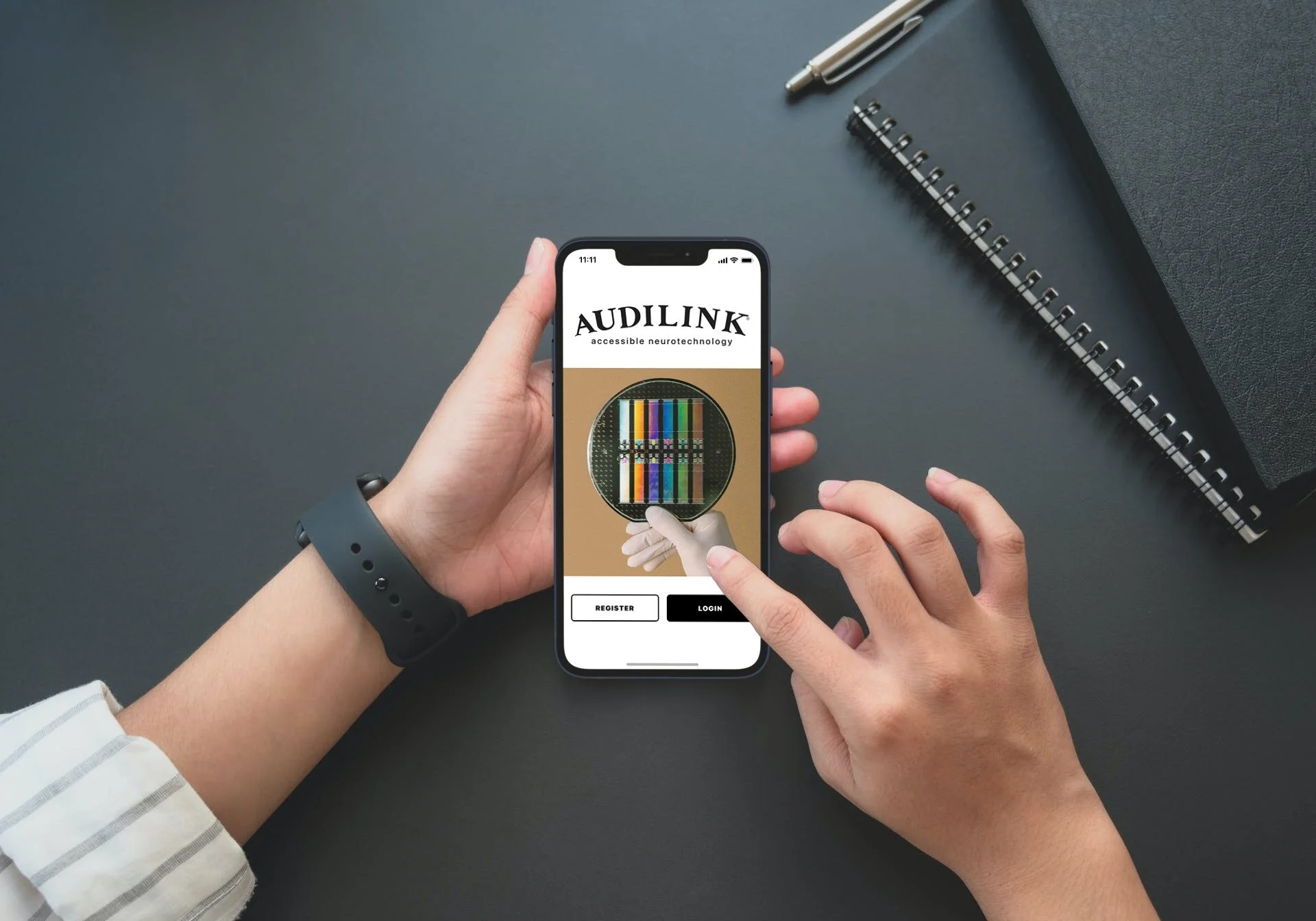
After someone in our ideation sessions suggested a brain implant chip that could hear for you — it stuck with me. I couldn’t stop thinking about what that would possibly be like for someone who can’t hear very well, or at all.
We were talking about something far different from a hearing aid.
This something would be attached to the Auditory Cortex part of the brain in a way that would allow sounds to become thoughts a person hears in their mind.
I was a little torn on going down this path because it does require a suspension of disbelief to assume the future medical technology is in place for having one implanted. But we probably aren’t that far off from something like this becoming available in the future.
UNCOVERING THE BASIC USER FLOWS OF AUDILINK

WIREFRAMES & USABILITY TESTING BEGINS

Once basic user flows were down, we began sketching wireframes so that usability testing with them could begin. It would be very basic and low key. I asked the users to point with a pen to the screens and buttons that made sense for achieving a few user goals we came up with.


After running several usability tests this way, we took those sketches into Figma and created digital wireframes with placeholder images.

Here you see the greyscale wireframes are overlaid back and forth with the high fidelity versions.
HIGH FIDELITY SCREENS

Home Screen

Settings Screen

Connect Screen

Support Chat Conversation Screen
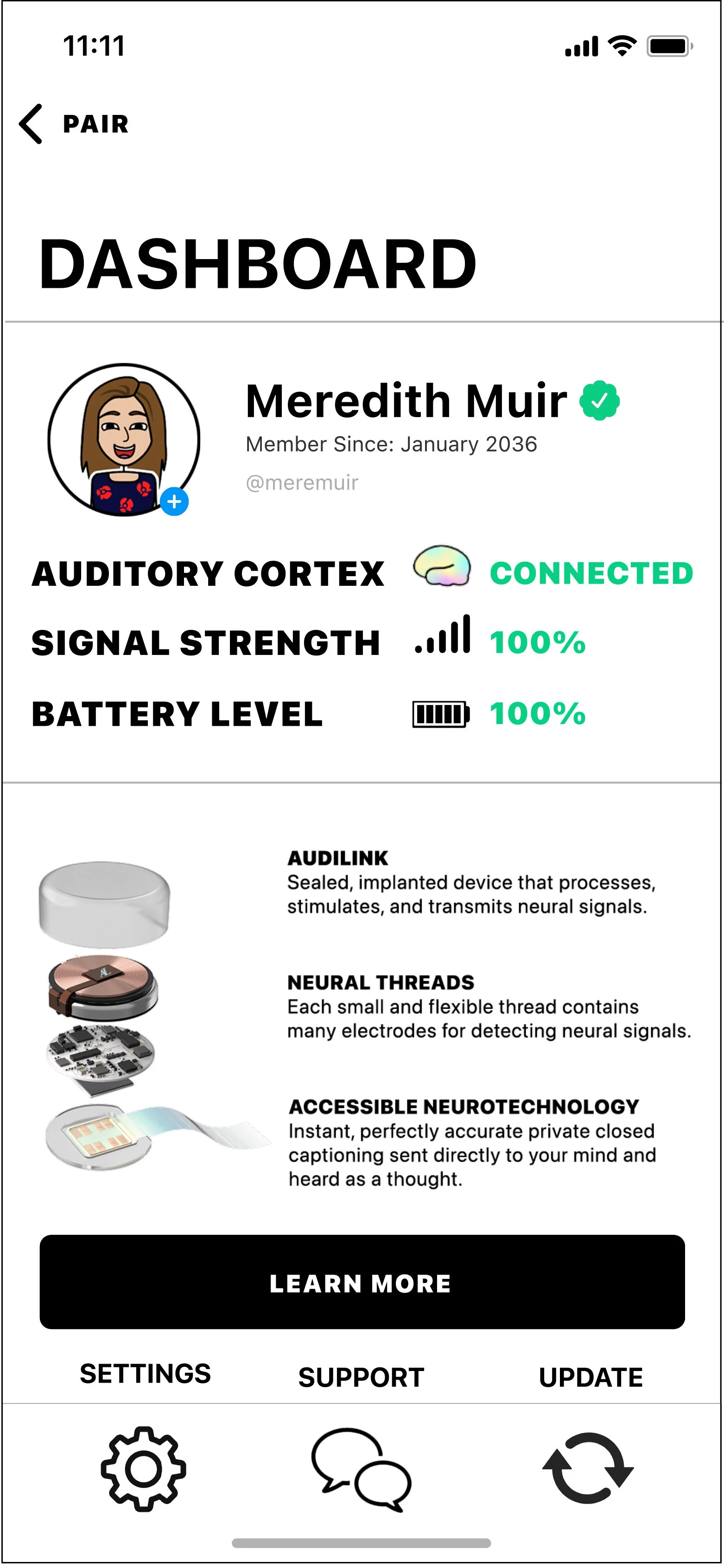
Dashboard Screen

Update Screen
THE FINAL PRODUCT

TAKEAWAYS
What an incredible learning experience! From this project the main takeaways for me would be:
Being open to pivoting is so important! Focusing on people’s behaviors, needs and feelings is a way to set yourself up for unbiased research and data.
Step back and let the research lead.
Remain flexible and iterative.