Catalyzing a Green Revolution through Data-Driven Innovation
ROLE/TIMEFRAME
Product Manager
An intensive four-week development sprint, dedicating over 160 hours to innovation and user-centric design.
PROCESS/METHODS
Our approach to this challenge was methodical yet creative, beginning with a foundation of rigorous research and synthesis. Through surveys, interviews, and the development of user personas, we gained deep insights into the customer journey. This informed our ideation and delivery phases, where rapid prototyping and usability testing were key to refining our concepts.
TOOLS
Figma for interactive wire-framing and high-fidelity prototyping.
Miro for collaborative ideation and affinity mapping.
UserTesting.com to validate our design assumptions through real user feedback.
Click play to view full high fidelity demo of Lowe’s Garden+.
THE PROBLEM
The challenge was clear: amidst a surge in interest fueled by tech-savvy millennials, Lowe's sought to engage users in a meaningful way, enabling them to effortlessly explore, plan, and nurture indoor and outdoor gardens. The goal was not just to facilitate plant purchases but to enrich the gardening experience, making it accessible and enjoyable for everyone.
THE SOLUTION
Lowe's Garden+ emerged as a novel solution to this challenge. Designed to be more than just an app, it became a journey into the world of gardening. From discovering new plant varieties to subscribing to a curated collection, Garden+ is a comprehensive mobile experience that caters to the nuanced needs of modern gardeners.
SURVEYS & INTERVIEWS
We put together a survey of 19 questions and got 27 respondents. With all of those data points the trends about feelings, needs and behaviors began to emerge.
INTERESTING SURVEY TRENDS
Our interview questions were constructed around understanding how customers are currently purchasing plants, identifying pain points in the plant purchasing experience in the past and if there is genuine interest in having a curated plant collection delivered safely to their home during these trying COVID-19 times.
A STANDOUT QUOTE FROM THE INTERVIEWS
“I went from having a completely lush, green apartment filled with plants to this new apartment in New York with really small windows. And as soon as I got here I was like, “I need plants.” It brings life into the room. It’s feels friendly. It’s a completely different environment and atmosphere with plants in a room and without. — Without plants, it feels like a gross dead room.”
- Nico from Chicago
AFFINITY MAPPING THE DATA
DEVELOPING A USER PERSONA FROM THE RESEARCH
Judith is a greenthumb who enjoys having plants at all times, wherever she’s living. She recently moved to a new apartment and is ready to fill her space with thoughful planter pots and plants.
BEHAVIORS
Buys mostly indoor plants
Purchases new plants all year long
An intermediate plant owner
Uses YouTube and Google as the go-to places to ask plant questions
NEEDS
Wants to buy new and interesting plants to add to her collection
Wants to purchase quality accessories: watering can, planter pots, fertilizer and soil, etc.
Very open to the idea of a curated subscription service that would ship her new plants on a regular basis
PAIN POINTS
Went online to several plant websites, but felt overwhelmed by all the options and categories and ultimately didn’t buy anything
Has ordered plants online in the past, but they’ve arrived late, damaged and didn’t look anything like the photos online
Left plants in places where they received incorrect amounts of light and they died
Accidentally overwatered many plants in the past and doesn’t want to repeat the mistake
“Without plants, it feels like a gross dead room.”
CREATING NEW SOLUTIONS
Ideation sessions were a really interesting way to gain interesting perspective from people who hadn’t been thinking about this idea a lot. This would prove very valuable in where the idea ultimately ended up.
HOW MIGHT WE?
UNCOVERING THE BASIC USER FLOWS OF GARDEN+
WIREFRAMES & USABILITY TESTING BEGINS
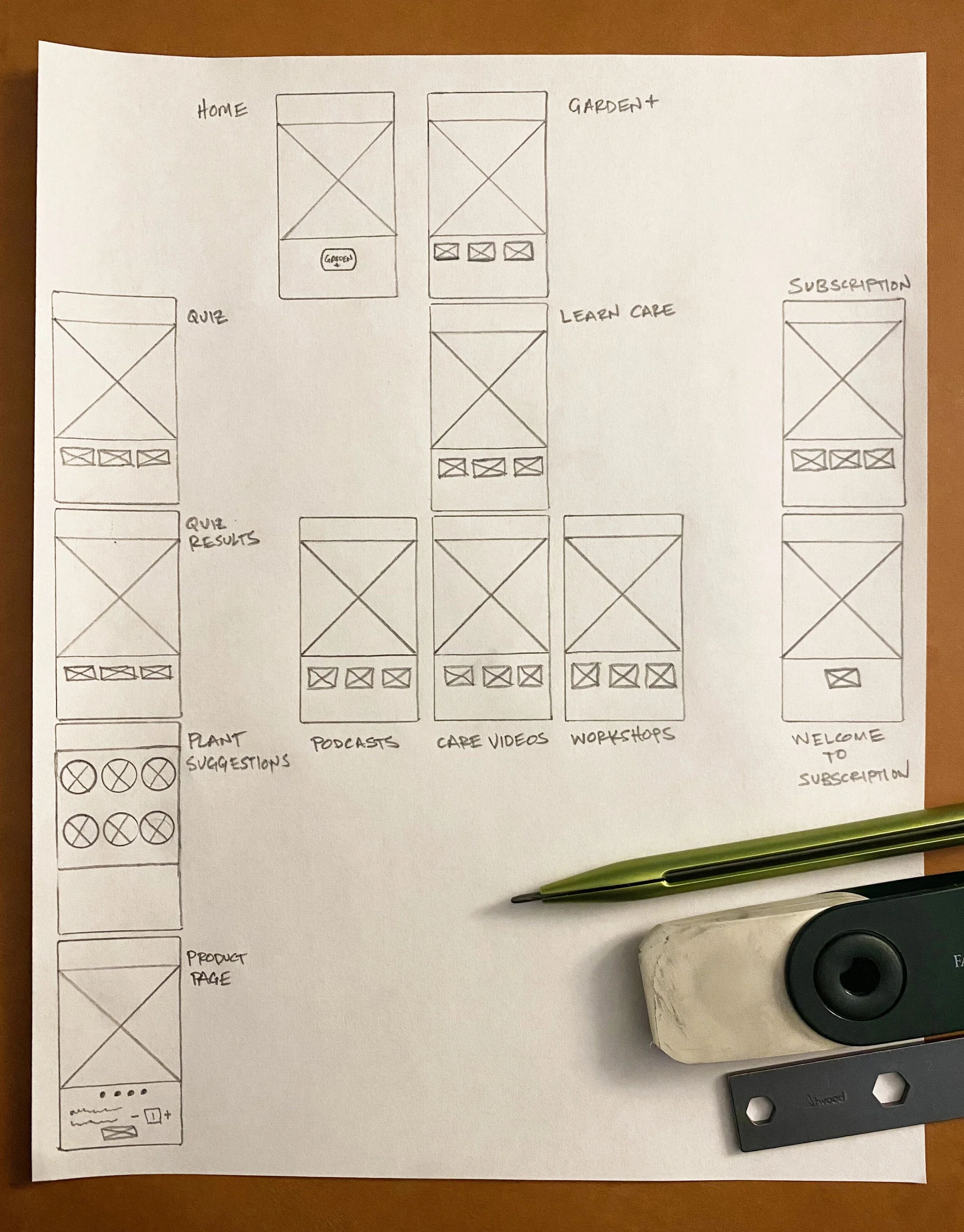
Once basic user flows were down, we began sketching wireframes so that usability testing with them could begin. It would be very basic and low key. I asked the users to point with a pen to the screens and buttons that made sense for achieving a few user goals we came up with.
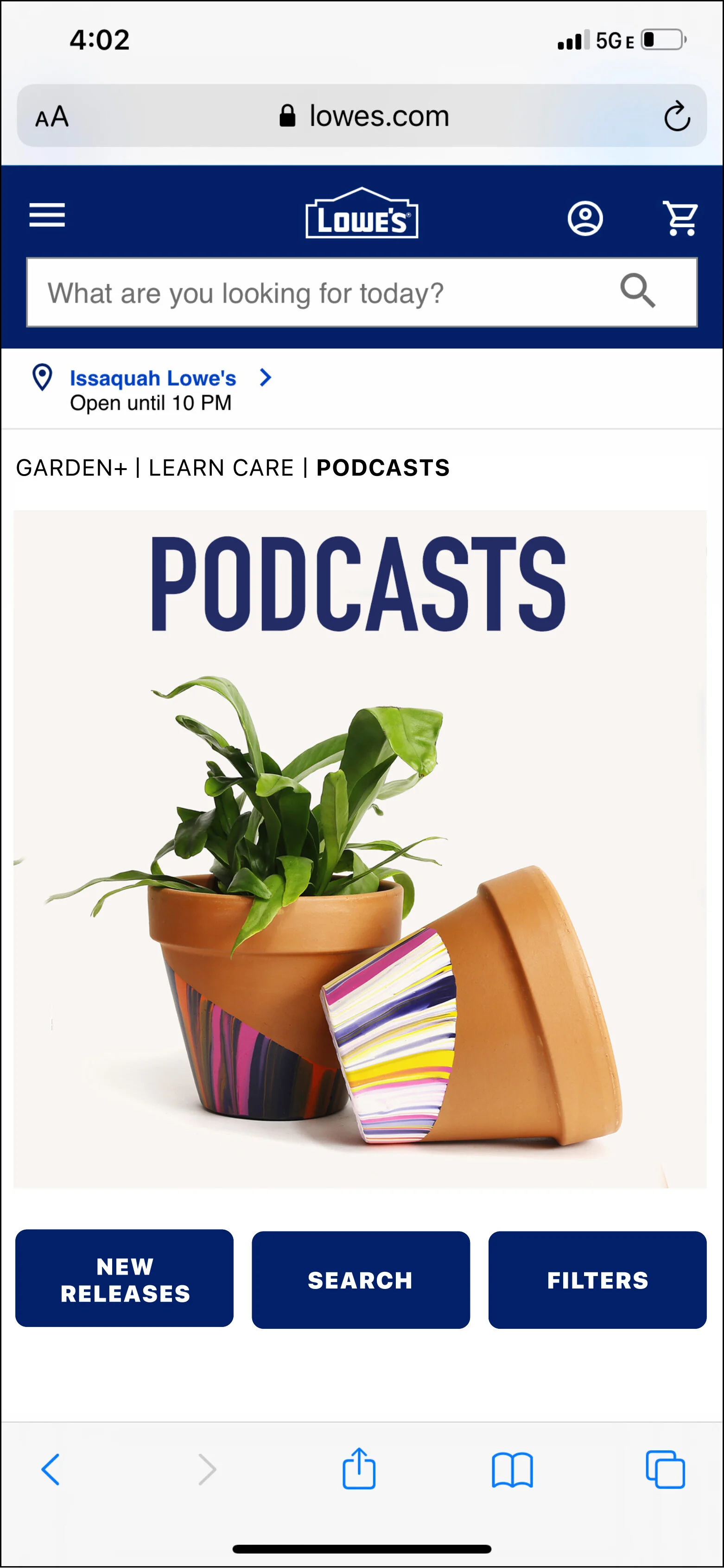
Transitioning from greyscale wireframes to high-fidelity screens, we crafted a visually appealing and user-friendly interface. This included features like plant podcasts, care videos, a plant discovery quiz, and a subscription service, culminating in a final product that exceeded expectations.
In this visualization, we alternate between the greyscale wireframes and their high-fidelity counterparts, highlighting the transition from conceptual design to polished interface.
HIGH FIDELITY SCREENS
Lowes.com Screen
Plant Podcasts. Screen
Garden+ Main Screen
Plant Care Videos Screen
Discover Plants Quiz Screen
Plant Subscription Screen


